
Pantone Colour of the Year 2020 — a Classic
The industry name for colour has announced their Colour of the Year for 2020, Classic Blue — the 6th time Pantone have opted for a blue in their 20 year history of colour trend forecasting.

Classic Blue (or 19–4052 in Pantone speak) is, in the company’s own words, “a timeless and enduring blue hue elegant in its simplicity.” Blues are often described as calming, peaceful colours; maybe this selection is Pantone’s way of bringing a sense of reassurance to the wider public going into a decade with so much uncertainty — Brexit, climate change, human rights violations in China, this list goes on. This return to the familiar comes as a comfort in an otherwise unknown social, political & economic climate.

Previous Colours of the Year, 2012's Tangerine Tango, 2018’s Ultra Violet & last year’s Living Coral were all of a more striking and unusual hue which some may have been hesitant to incorporate into their interiors; Classic Blue, while still being a big beautiful bold manages to be a much easier and less intimidating colour to showcase in the home.

Dependant on your own preferred style, there are many exciting ways of adding a sense of stability & tranquillity along with that all important cool to your interior:
If you are all about the dark decors, maybe a few Classic Blue cushions thrown in with a pop of fuchsia would go down a treat; if you prefer a retro feel a striking Blue feature wall would work better for you or for that chic modern twist on an old school classic, a sumptuous velvet Blue Chesterfield would look absolutely beautiful in a lounge reminiscent of a Victorian library.

The beauty of this versatile colour is that it can be used in any room of the home, offering a smart finish to a monochrome kitchen, a calming space to relax and reflect in a lounge or bedroom or even as a rich addition to a home office in an effort to de-stress an otherwise potentially demanding area.

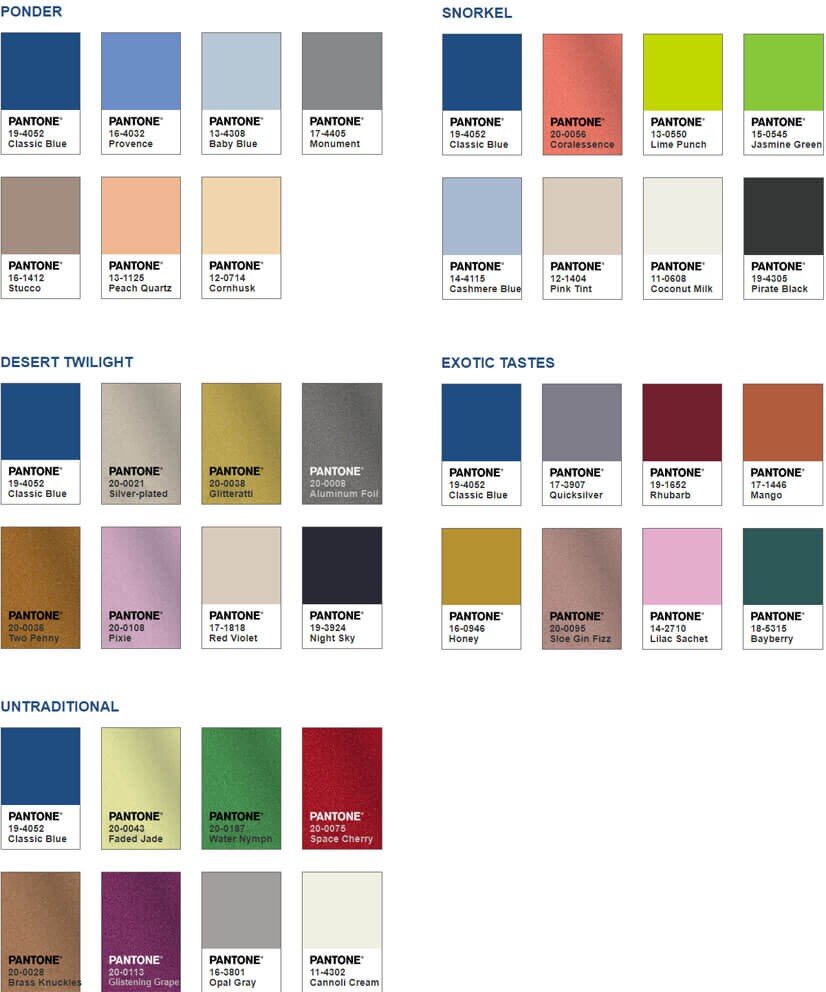
When it comes to mixing Classic Blue with other colours, its quintessential simplicity means it’s difficult to get wrong. If you prefer the blue to be the standout colour of your interior, pairing with either greys or neutrals is the cleanest and easiest way to go. If however you prefer a bit more of a riot of colours, then pairing Classic Blue with coppery oranges, buttery yellows or leafy greens (or even all three!) is a surefire winner — take a look at the colour palettes Pantone have created for more inspiration:
My name is James Broad, antique & curio enthusiast turned entrepreneur. I buy, restore & sell beautiful things for homes & commercial interiors. For more information, check out my About Me page; for products, have a look at my Inventory & for anything else, well, just click on the big CONTACT button.